


Which colour of linen do I want?

At this time of year, I’m often asked what linen suit, jacket or trouser a reader should get. Their eyes are turning to summer, and often an event that will involve summer tailoring.
We’ve written about the appeal of linen in general before, and about the different linen bunches in detail – both in the Guide to Cloth. But the question people ask most often is a very simple one: what’s the right colour?
So here’s my breakdown of what colours to consider and why – for trousers, suits and jackets. As this is PS, it’s all done in a very logical order.
Light or dark?
The first question to ask yourself is, do you want a linen piece that is light in colour, because that’s part of the appeal, because it’s meant to be a glorious reflection of the sun – or, is it more about coolness and subtlety, and something darker would therefore be better.
I find readers usually have one or the other in their mind already, and it’s good to articulate it. The two are quite distinct, and separating them is a quick way to cut down the choices.

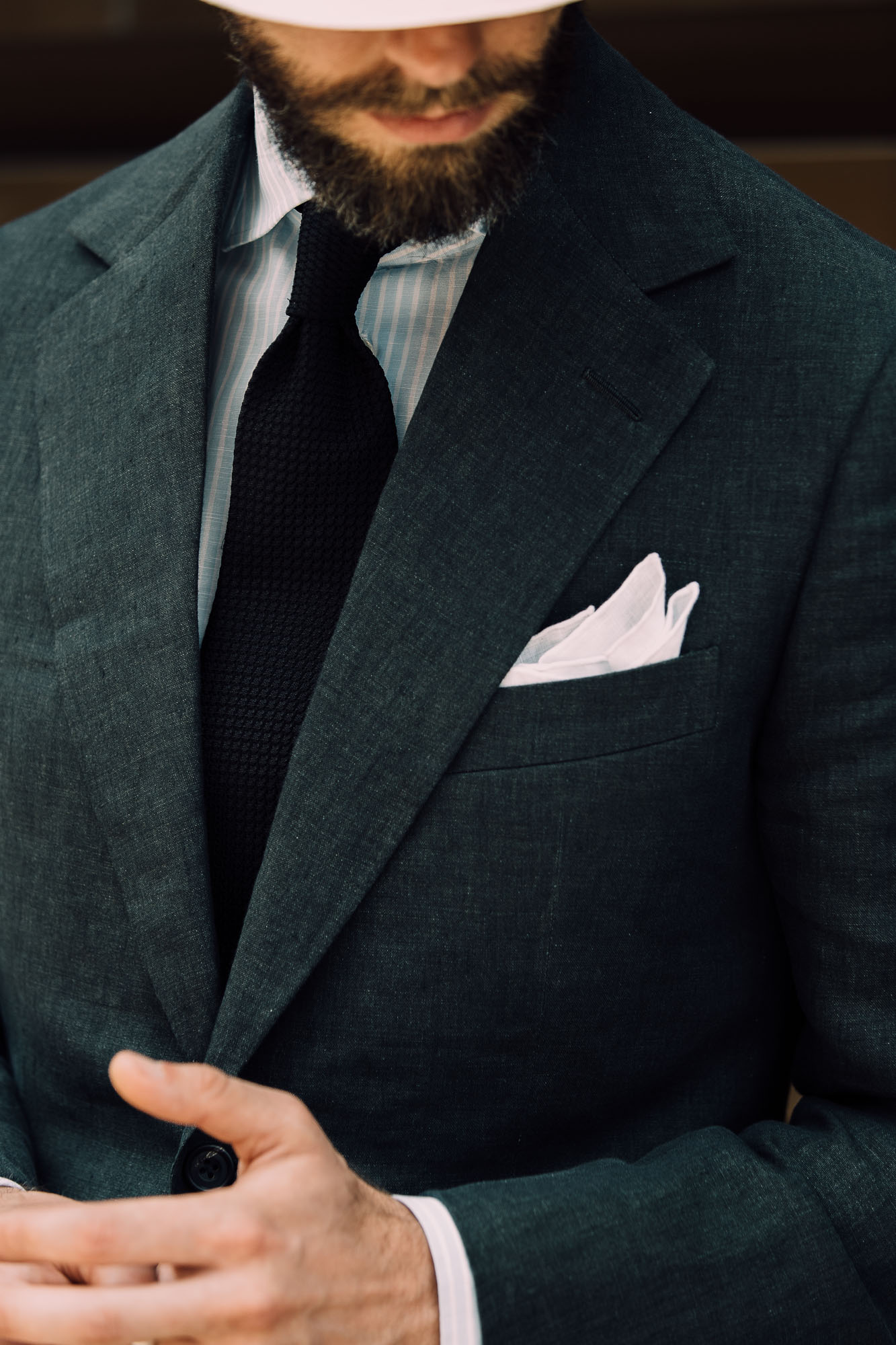
If dark: start with brown and green
Linen is, in general, best suited to earthy colours like brown and green, rather than more formal business colours such as navy or grey. Linen is an absorbent fibre and takes colour very well, plus its natural texture and slubbiness (as well as, of course, creasing) give it an inherently rustic feel that suits these colours.
So if you want a dark linen suit or trouser, I’d look at dark browns and olivey greens first. Above are two examples of mine: a dark-brown linen suit from Edward Sexton, whose trousers I also wear very often in the summer; and an olive-green pair of trousers from Whitcomb & Shaftesbury.

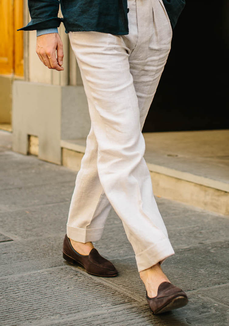
If light: go for beige or taupe, not cream
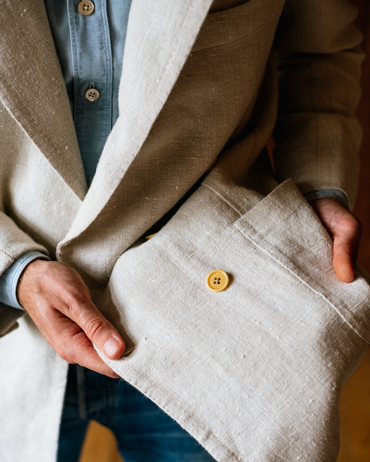
I still hear it said that a cream-linen suit is a wardrobe staple. Well, I’ve tried that twice and a real cream suit is a hard thing to wear. It’s very bright and showy. If you do want a linen suit along these lines, don’t get white or cream – get off-white, beige or a pale taupe. They’re a lot easier.
Using the W Bill ‘Fine Irish Linens’ book as an example, you definitely don’t want white (61370) as it will look cheap. Cream (61369) is better but is quite rich, perhaps OK in a pair of trousers but striking as a suit. The slightly darker cream (61364) is better still, but my favourite is a slightly grey biscuity linen like the Mersolair pictured higher up, or the Solbiati beige above.
Also, I once saw a beautiful Anderson & Sheppard suit made for King Charles waiting for alteration – and that was in W Bill 61361, which is almost a pale grey. It’s been on my mind ever since.
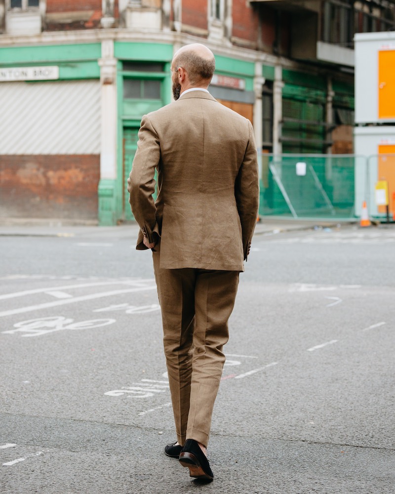
You might even call that colour a light taupe, and taupe is a good colour to consider for something that’s between light and dark. My Armoury suit shown above, for example, is a kind of taupe, and it’s proved very wearable.
Taupe is a mixture of brown and grey, with the brown itself varying a little as browns do. The important thing is that mixing it with grey makes it a muted, more neutral colour – and avoiding strong colour is really the cornerstone of this whole first set of recommendations.
The cloth I used for my suit is no longer available, but W Bill 61360 looks quite close to me. Manish’s beautiful ‘cappuccino’ colour of the Art du Lin cloth is also a good example here – one exclusive to the Anthology.

But what if it’s a jacket?
These recommendations apply to all linen garments, but especially to suits and trousers. As with everything from tweeds to high-twists, jackets are a little different.
First, pale linen jackets are much easier to pull off than suits. A cream linen jacket can be worn in lots of ways, as illustrated here. Also as Manish has discussed here, light jackets with dark trousers are often easier for guys these days than the more traditional dark jacket and light trouser.
Jackets also benefit from a little more texture, pattern or colour. My Salino linen jacket (above top) is most suited to a jacket rather than suit or trousers, because of its texture (it’s Mildmay linen from Hellard). Maison Hellard is particularly good at textures and patterns – as you can see from their Heures Bleus collection.
The other advantage of a linen jacket with clear pattern or pronounced texture is that it makes it easier to wear plain linen trousers with it – as I am also doing in that outfit with the Hellard jacket.


Strong colour is nice, on occasion
Because linen takes colour so well, you often see strongly coloured linen jackets (the Holland & Sherry range is particularly good on this). The problem with strong colours is twofold: they look best in bright weather and they’re very memorable – you only have to wear a bright green jacket two or three times and you become the guy that wears ‘that’ jacket.
Still, if you spend a lot of time in Palm Beach or you already have the others bases covered, bright colours can fun. My orange jacket from Anderson & Sheppard above is lovely, even though it only gets worn two or three times a year. Manish has a nice dusty pink.
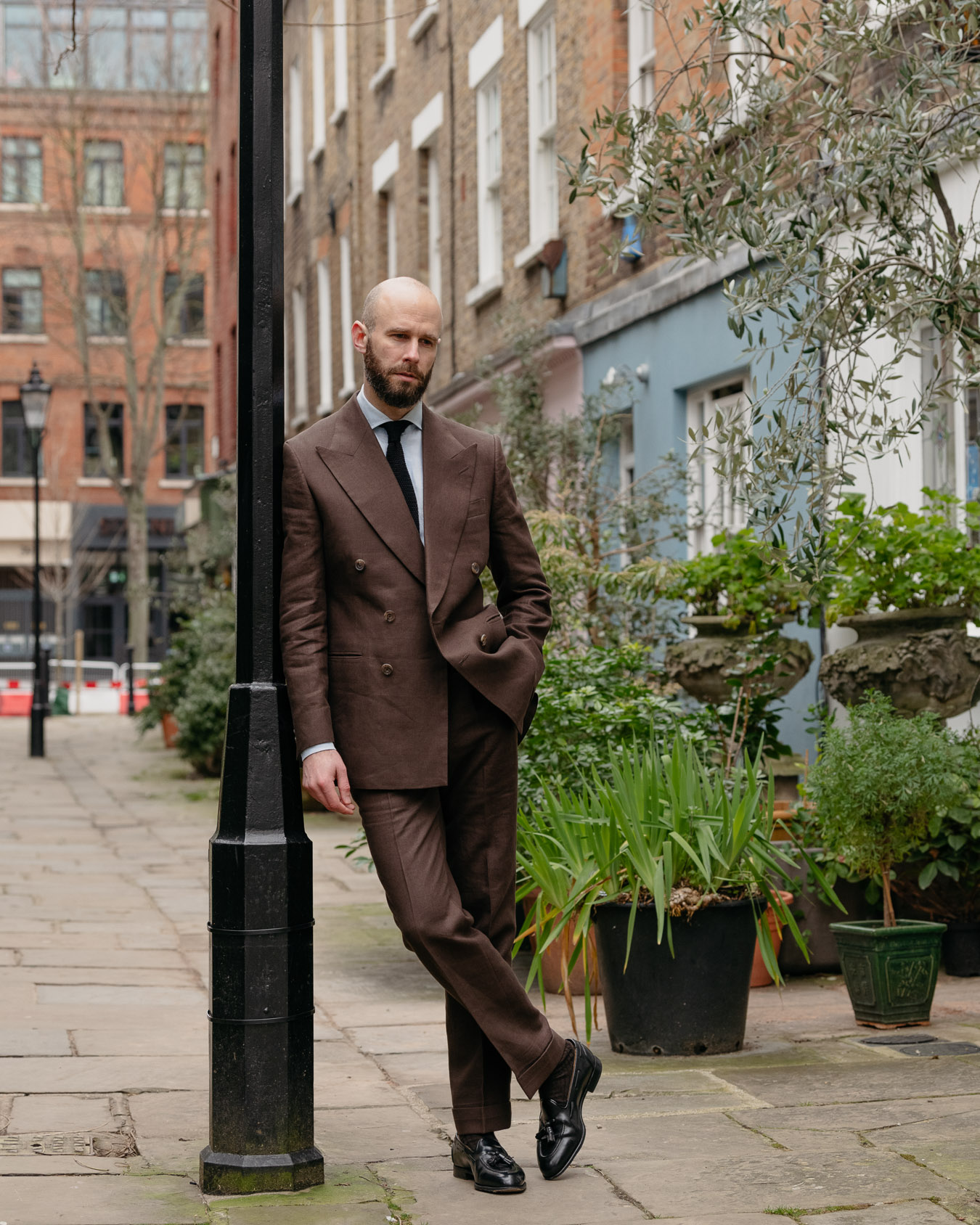
I’d also put tobacco-brown linens in this category. A tobacco-linen suit is a very chic thing to wear, but it is fairly strong. I wear mine (also above) as a suit mostly in places like Italy. In the UK I’m more likely to wear the two halves separately.


Blue rather than navy
The reason navy doesn’t usually look great in linen is that it quickly looks dusty and old – very different to how the same colour looks in a worsted business suit. There are exceptions, however.
One is the specialist bunch Art du Lin from Solbiati, which has a matte, almost suede-like surface texture. This looks better in navy I find, though still great in the leading colours such as beige or dark brown (see image at the top of article).
The other exception is that if you push the navy into more of a mid-blue, without getting too bright, it can be versatile in the same way that denim is. Above, in the first image Manish is wearing a jacket in a cotton/linen mix from Decorum, but a blue like W Bill 61380 isn’t far off. This is much more wearable than my brighter blue, above that.

Other colours: Black, green, grey
There’s a reason some of these other colours haven’t come up until now, but they do have their place. Black, for example, can be a nice evening-wear option in linen, and can even work as a blazer alternative when it’s paired with other murky colours (above, by Cifonelli). It can also make useful trousers if you wear quite a lot of neutral colours.
Stronger greens, as opposed to muddy olive, can be nice in the same way many linen colours can be, if you like stronger colour and you know how to combine it with things like cream and grey in order in order to tone it down, when you want to. I’d put my Solbiati green above also in that category, because it’s such an unusual colour.
Grey linen I’ve also found tricky. I do have one pair and I think they do look chic in the summer with something like a dark-navy knitted polo shirt and soft black loafer. But as with these other colours, it’s just quite limiting.


